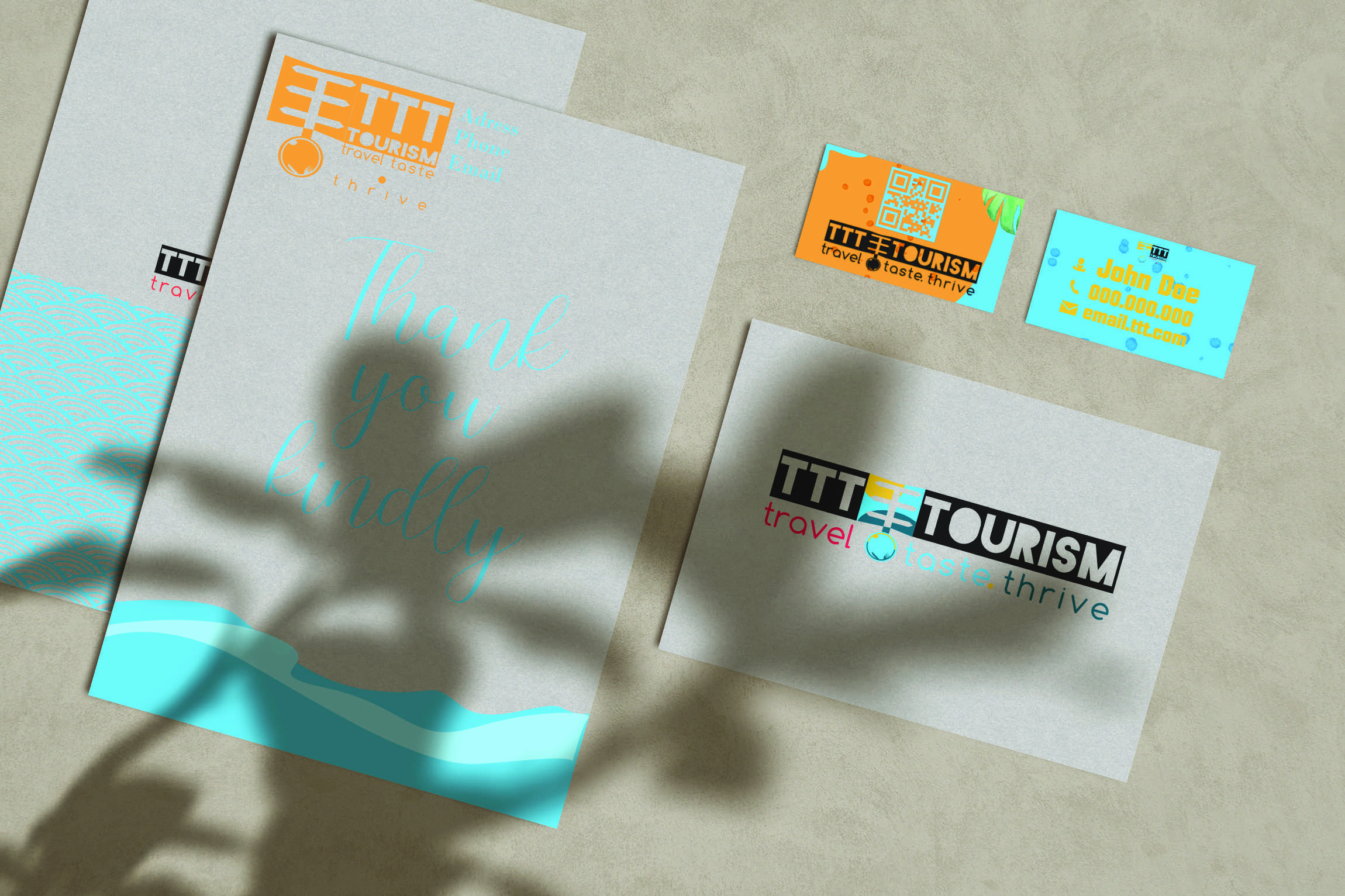

This logo is a slighlty modified version of a logo with which I competed in a 99Design.com contest. I mostly changed the name of the company and that's about all. The company is a tourism agency focused on culinary tours and experiences. The logo represents a road sign with a plate at it's base and it is an symbol of sun and water, summer vacation. The colours represent sun and water in different parts of the day. The font used is blackout as it gave a blockout fill on the entire logo. It is a hard logo to be used anywhere so many vertical and horizontal versions on different colours are made. The tagline uses Comfortaa font to balance the blocky overal look. Mext I will represent several different online ads campaigns that take account of the logo composition and give an overall unitary felling.
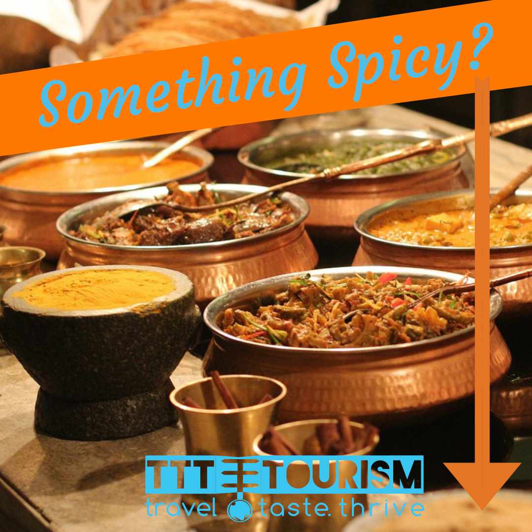
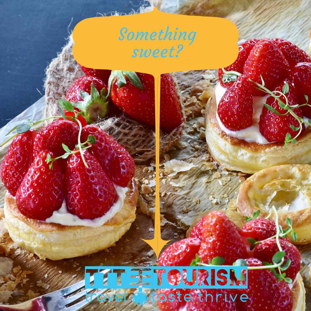
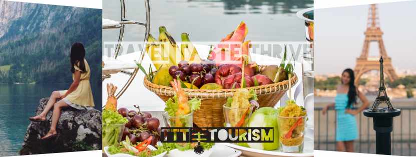
The first provided sets are targeted to a generalistic aproach to introduce the brand and attract people to the company website. Thei are colorfull and vague, becoming decent "clickbates" by being misleading in their message, seeming like an ad for a restaurant bussiness, a much more daily basic activity thant traveling tours.The format is mainly for instagram posts and can be adapted in the same way for other domains.
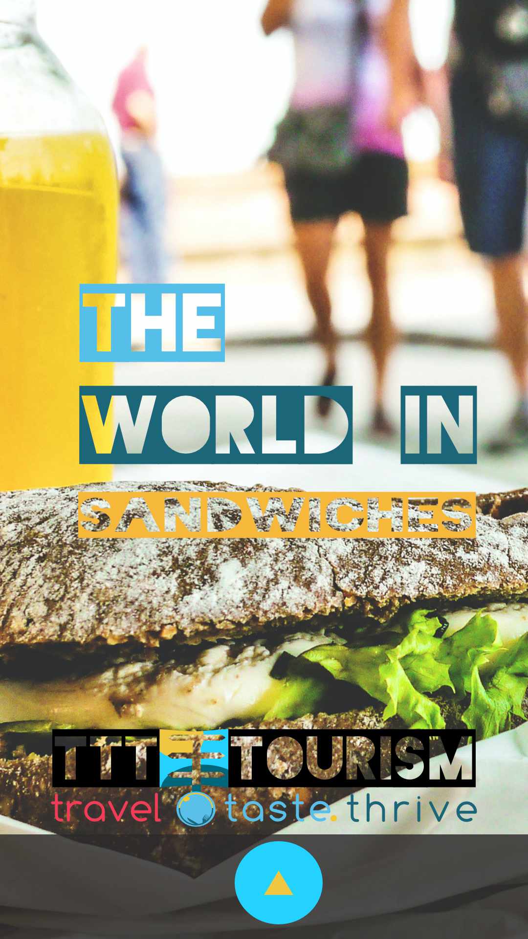
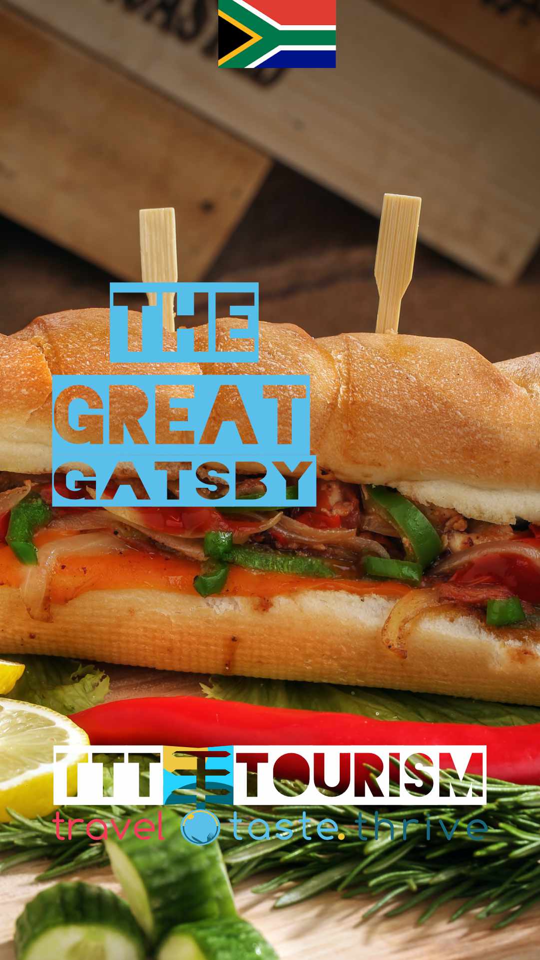
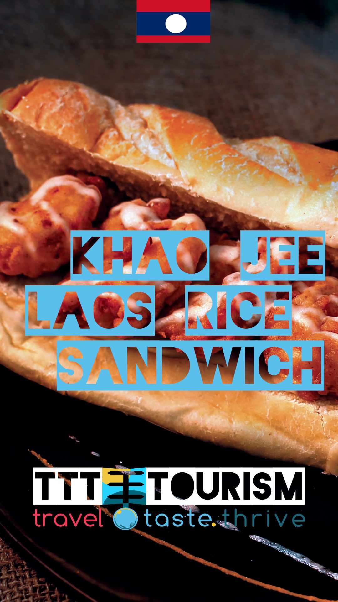
This campaign is aimed to promote "weekend breaks " in different parts of the world taking in the center specific local sandwich cousine and provides local supply of sandwiches. The campaign is aimed on mobile phones devices and it appeals to a well known product - the sandwich to promote short stays and it provides a challenge for the user- "Eat this sandwiches in 12 weekends at their roots"
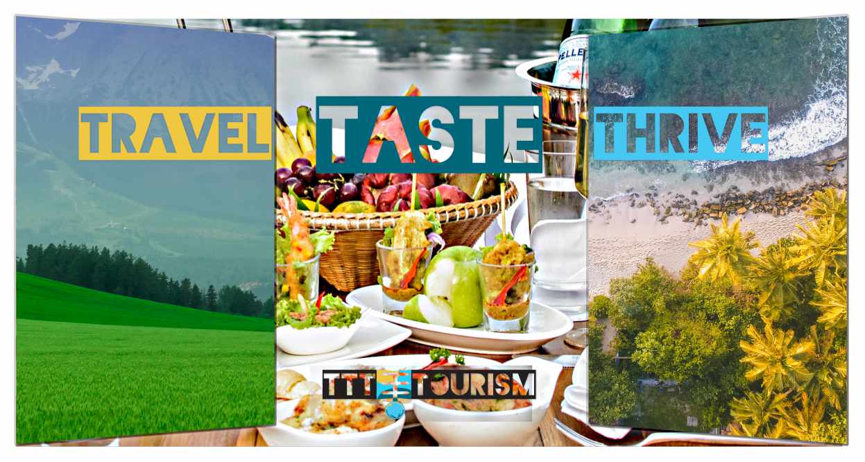
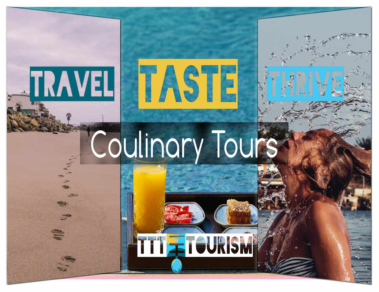
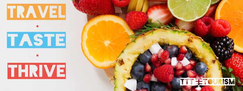
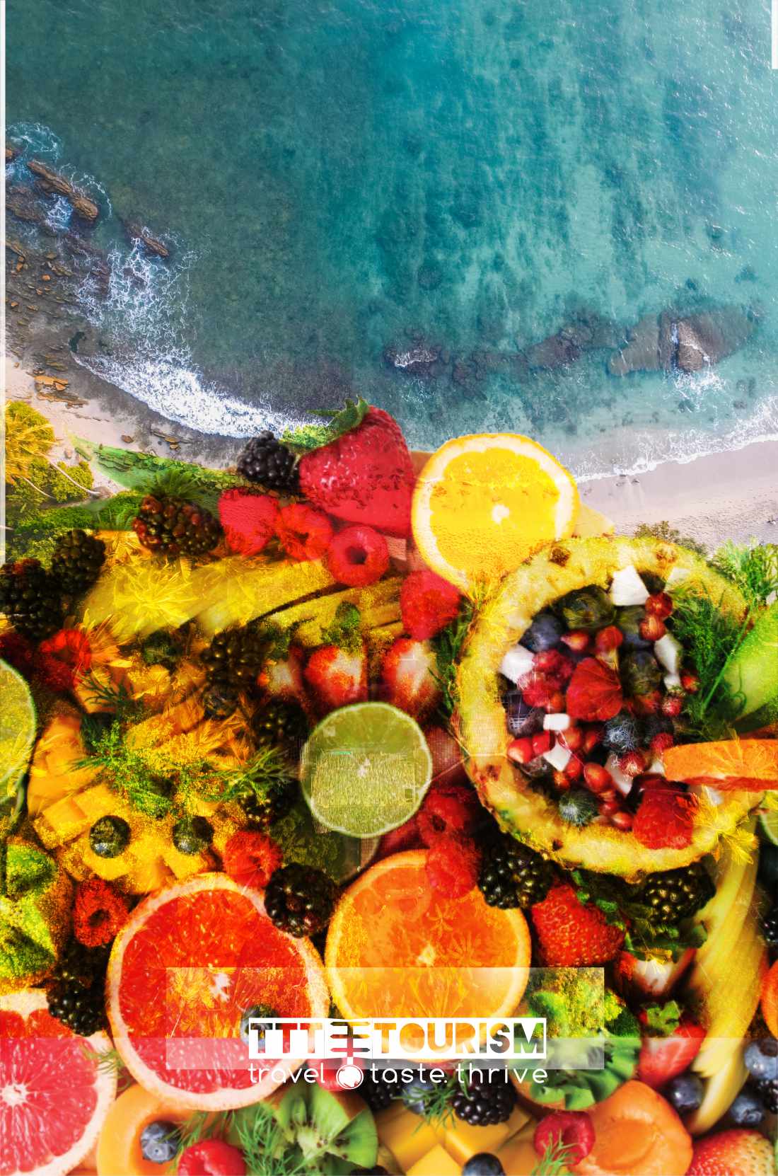
The following campaign is aimed at promoting exotic culinary tours around the world by emphasizing the freshnes and uniqueness of ingredients. As the other campaigns powerffull colors and combinations of sun and food are promoted to give a felling of exoticness and special to the entire campaign. The company portraits itself as an gate (even from the logo form), a guide to the rich experiences provided by the tours. This is the main product type offered by this imaginary company :); The campaign also uses the tagline "Travel Taste Thrive" to establish the points on which the brand functions.

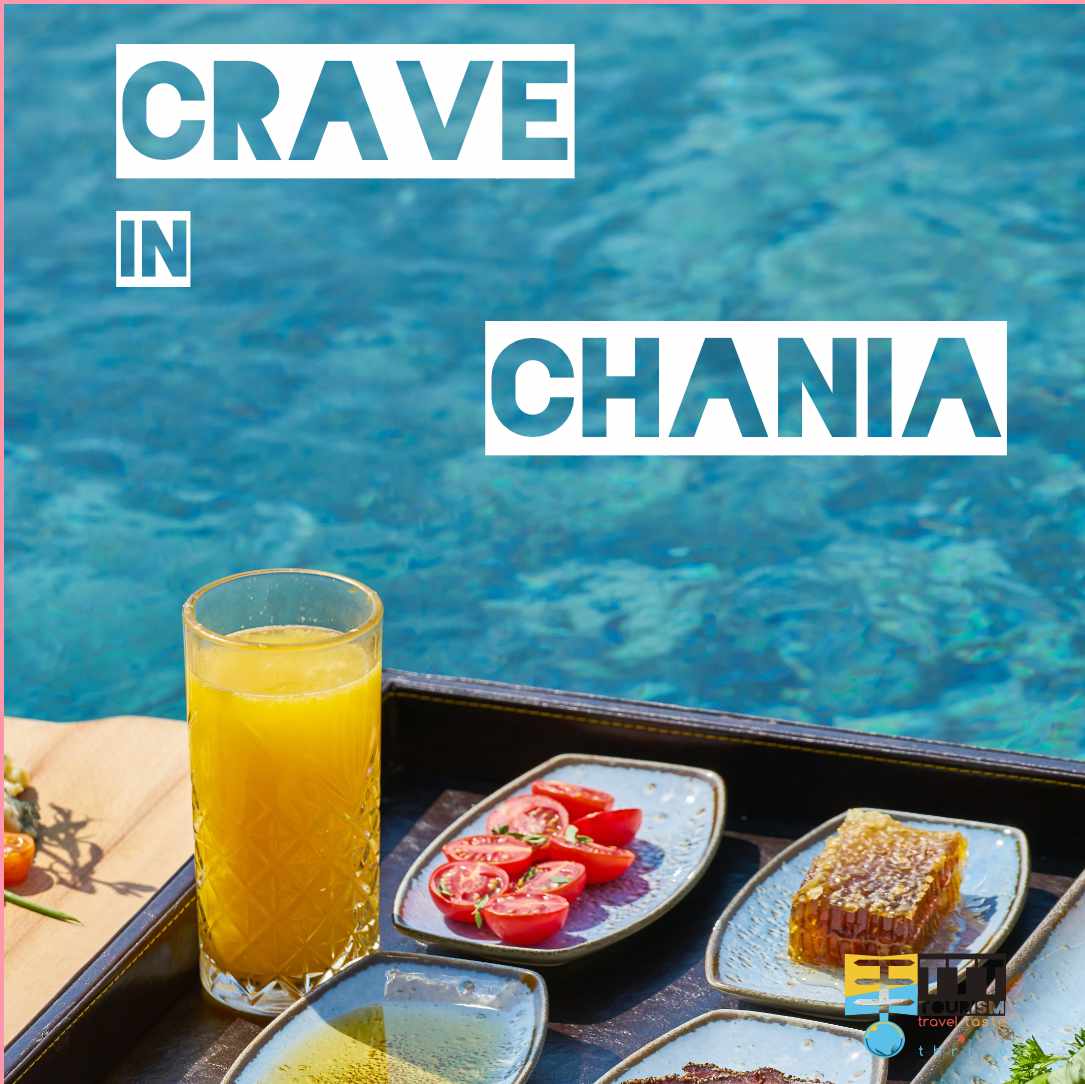
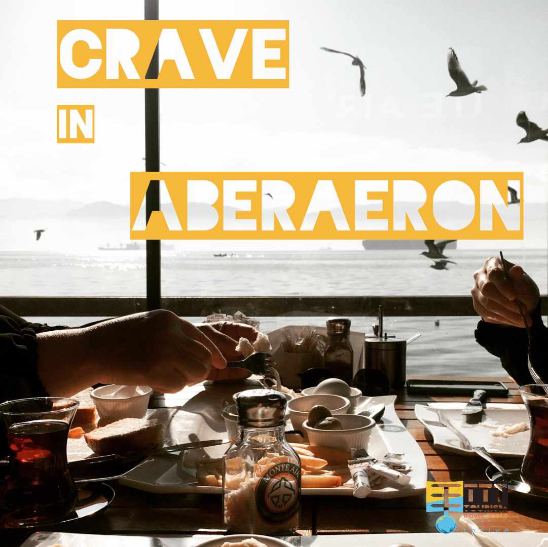
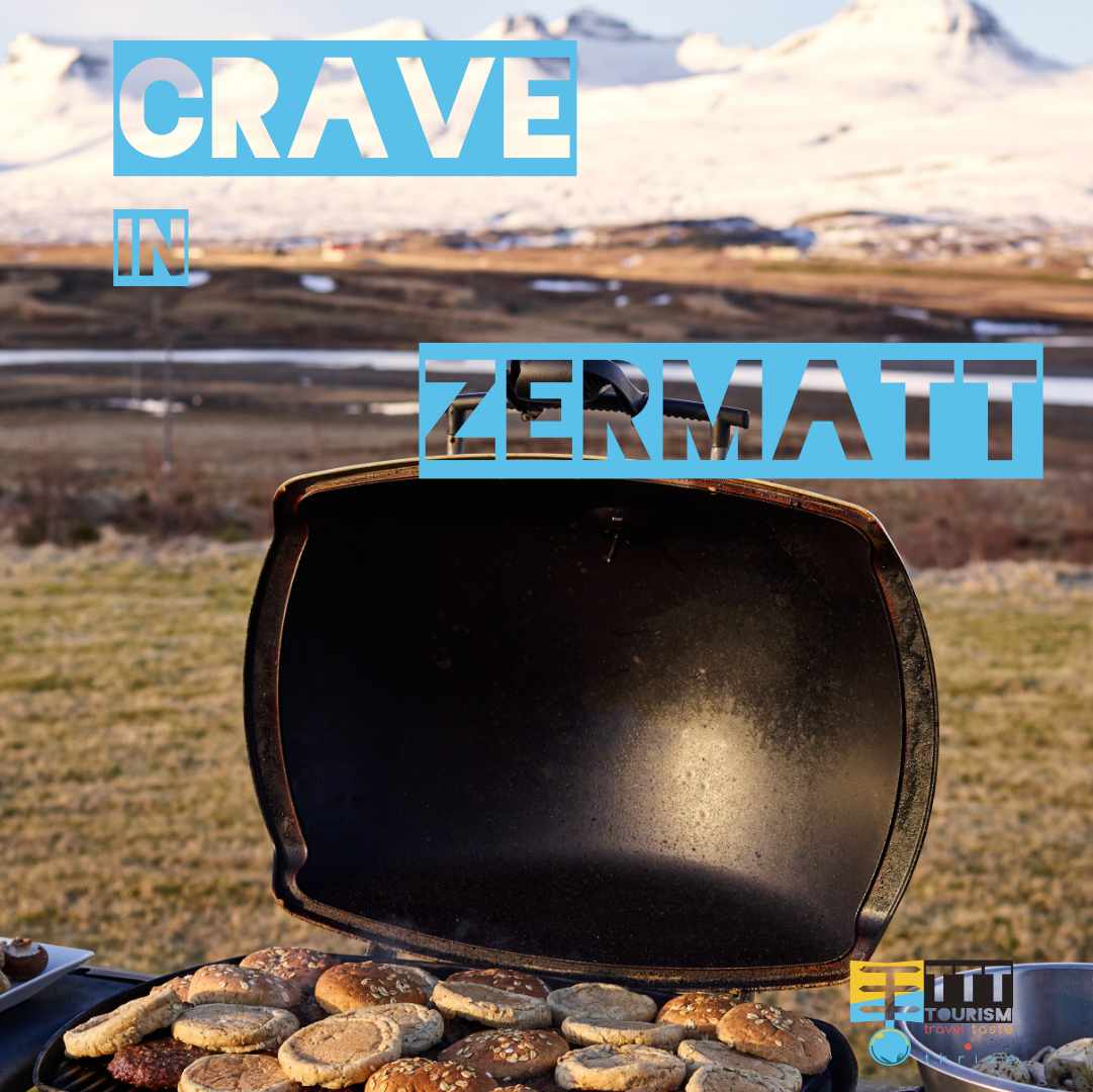
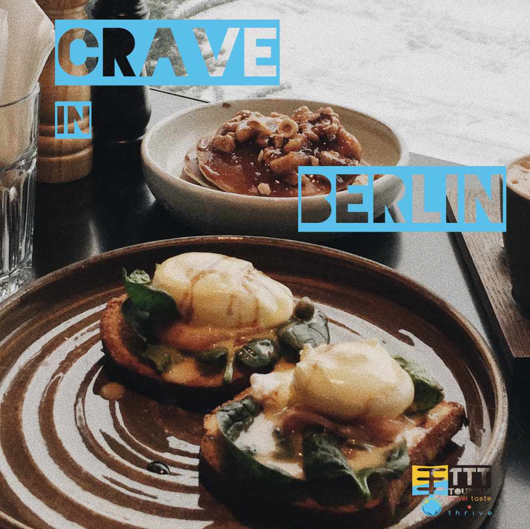
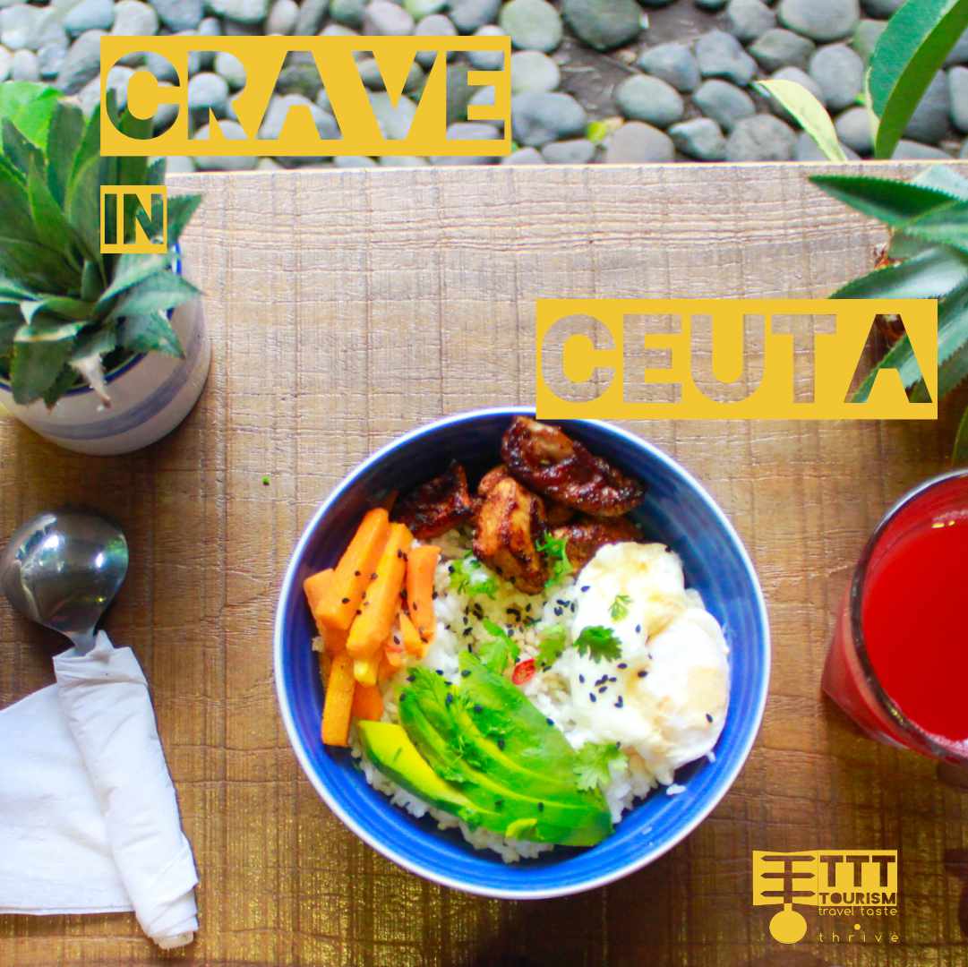
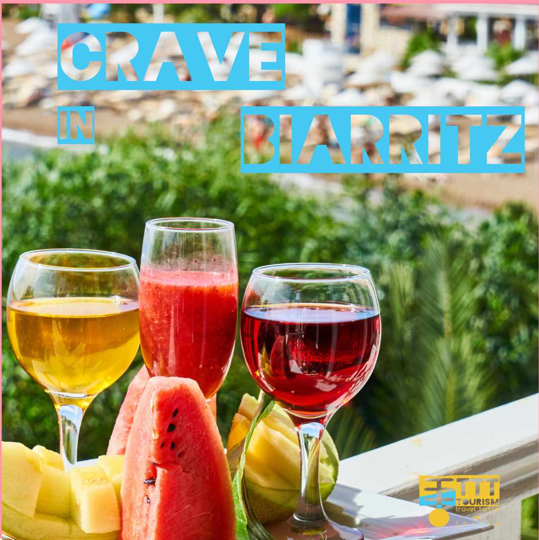
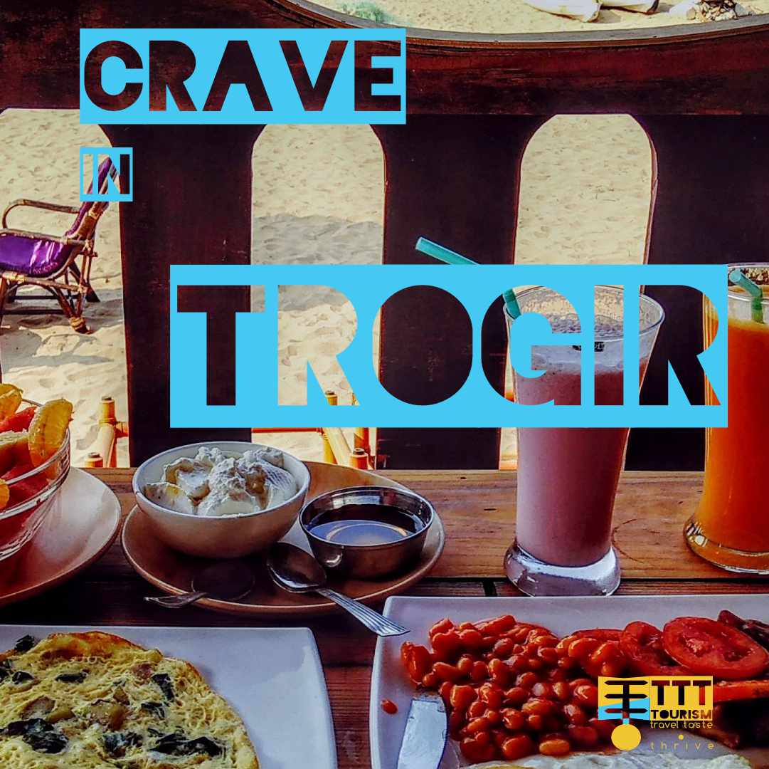
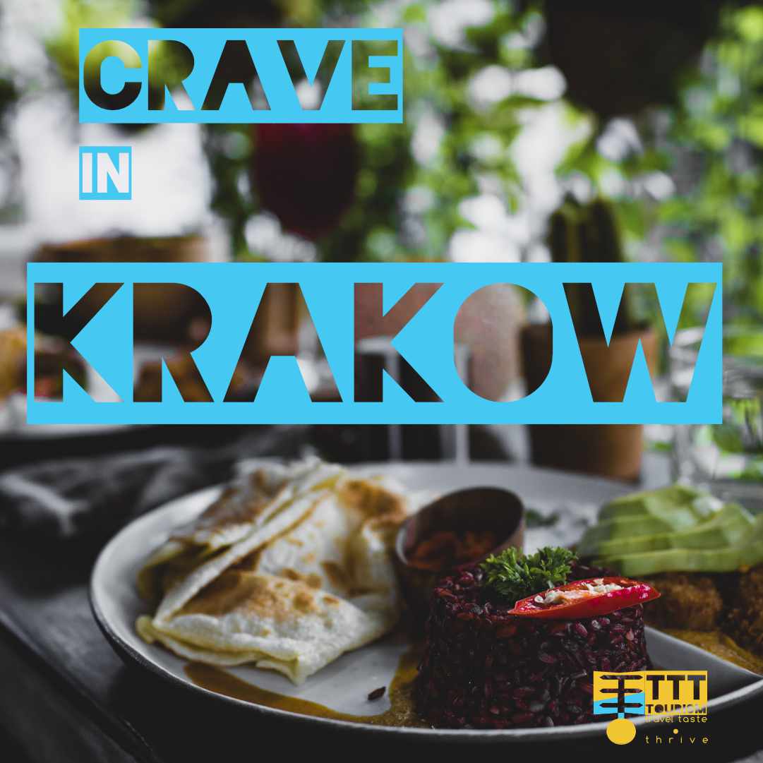
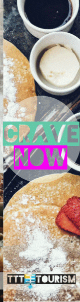
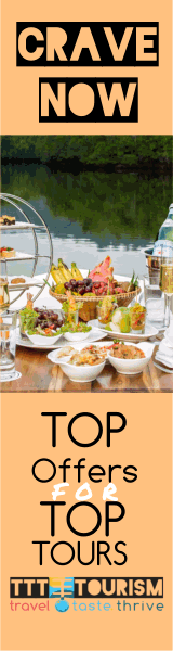
This campaign has a strange call to action "crave". It is meant to promote different weekend escapes in different cities to reveal the culinary part of them. THei respect the same colorfull aproach and bloaky text as the othercampaigns. It is meant to get you wishes of seeing these locations by simplicity color and ambiguity.